Visualizing Employee Compensation
All graphics below are based on simulated data
One of the most important things a start-up can do is set up consistent pay practices that are benchmarked against the market. It helps growing organizations attract, reward, and retain talent - and feel confident they are doing the right thing for their employees.
Answering the “are we paying people correctly?” question is one we hear from a lot of start-ups. And of course, ‘correctly’ can take on many definitions; it can mean aligned to a specific percentile of the market, rewarding high performance, paying fairly across genders, etc. Benchmarking salaries and creating compensation ranges are a common exercise we do for clients to answer this question.
Once this work is done, an impactful way to understand your organization is to see everything in one visual. An example is below, a graph our clients have referred to as “the dot graph” -
Here, every employee is represented by a dot. It’s easy to observe that for the most part, employees in this organization fall healthily within the salary bands, but one area to check out is Level 4, where the majority are falling below the middle of the range. It could be that these ‘dots’ are underpaid, or that they’re mis-leveled, or they need to be in the salary band of another job function. In any case, it helps you pick out where your next level of examination needs to be.
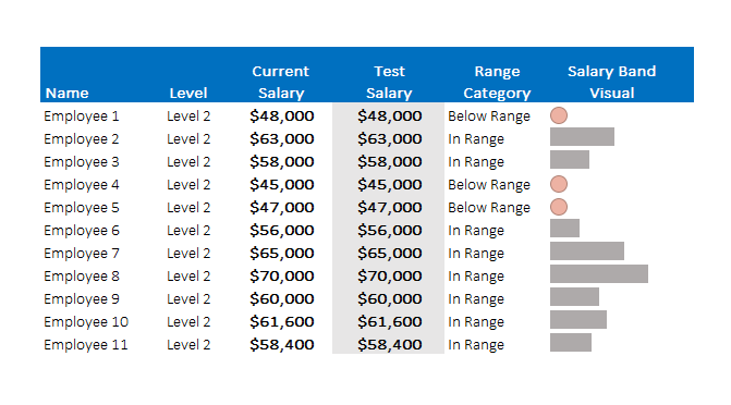
In addition to an overall visual summary, you can also look at salary data at the employee level. When companies give promotions, merit increases, or are thinking about making market adjustments, it’s valuable to understand how an increase to salary impacts an employee's position in their market salary range. Below is a way of visualizing this as part of an excel file.
In this case, the video shows that changing the “test salary” will change the salary band visual. The closer the gray bar is to the end of the cell, the closer to the top of the salary band.
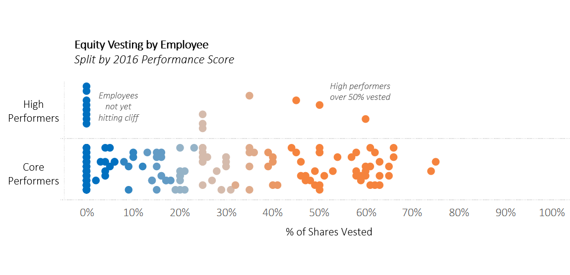
In addition to base compensation, we often work with employee equity. As with base salary, equity is part of a compensation package that can be used strategically to reward and retain employees. The visual below shows how vested employee options are across the company, and can be used to aid in deciding a retention grant strategy -
This graph separates out high performers, and shows that that only a few of them are nearing or more than 50% vested. However, ‘high performers’ in this graph could be swapped for any category of employee that decide you want to retain as part of your strategy - hard to find skillsets, senior leadership, or employees that are critical to the organization.
In the end, there are many factors to consider when thinking about employee compensation, but data visualization can be a helpful tool to help you synthesize all the numbers, understand trends and patterns, isolate outliers, consider different options - and ultimately to make more informed decisions.
Written by Sam Feldman
People Analytics Manager
(and resident data viz addict)


